
Visualizing Competitor Research in Tableau
Visualizing the routes Acme Travel Corp is searching for on ourwebsite.com
Years ago, I was curious if our competitor (Acme Travel Corp) had analysts like me, and what they were interested in on our website. In Google Analytics, I searched for users who behaved like I did on acme.corp—visited the site multiple times a day, searched for several travel schedules without purchasing, and looked during business hours (business hours that are very different than our average users' regions).
Then I took a look at this cohort's geo data to ensure I had the right users. Sure enough I was seeing a lot of abnormal traffic from a region we don't offer services to and is the home of Acme Travel Corp.
Finally, I narrowed down the traffic by Service Provider which included variations of Acme Travel Corp ("acme", "acme travel", "travel acme corp"). I created a segment "Acme Corp cohort" and used it to filter the data used in this visualization.
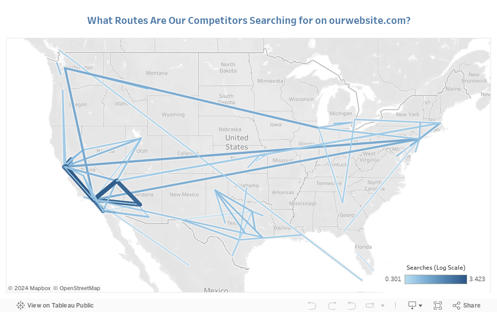
This "Acme Corp cohort" had the following behavior on ourwebsite.com over a 10 month period:
Over 1,500 sessions on our website
23 avg. pages/session (mostly Choose Your Route page views, site avg. is 3 pages/session)
5 minute avg. session duration (site avg. is 1 minute)
Traffic spiked during the same month Acme announced expansion into our region
Unsurprisingly, the top 10 city pairs they are interested in on our website are on the west coast where they have begun services.
In addition to the cities they are already providing service to, the increased searches on the east coast suggest they may be starting bicoastal routes to New York, New Jersey, and Boston soon.
Unfortunately the Service Provider dimension is now deprecated in Google Analytics, but you can read my blog post to learn how I used it to detect competitor traffic.